11:24:26 UTC
Making everyday services faster and easier.

Note: This product is in active development
The average user already relies on multiple applications throughout the day. One app for food delivery, another for ride-hailing, a different platform for hotel reservations, another for grocery shopping.
While each service solves a specific problem, switching between platforms creates friction, inconsistency, and unnecessary complexity.
Speedy was envisioned as a unified ecosystem where users could access essential services through a single experience without sacrificing speed or convenience.
The challenge wasn't simply adding more services into one product, It was making multiple services feel like one product.
The Challenge
Designing Speedy meant solving two competing problems, on one hand, the platform needed to offer a broad range of services and on the other hand, users needed to immediately understand where to go and what to do.
Without a clear structure, the experience could easily become cluttered. A user looking for a restaurant should not feel lost among hotel bookings and ticket purchases. Likewise, someone hiring a car should be able to complete their task without navigating through unnecessary screens.
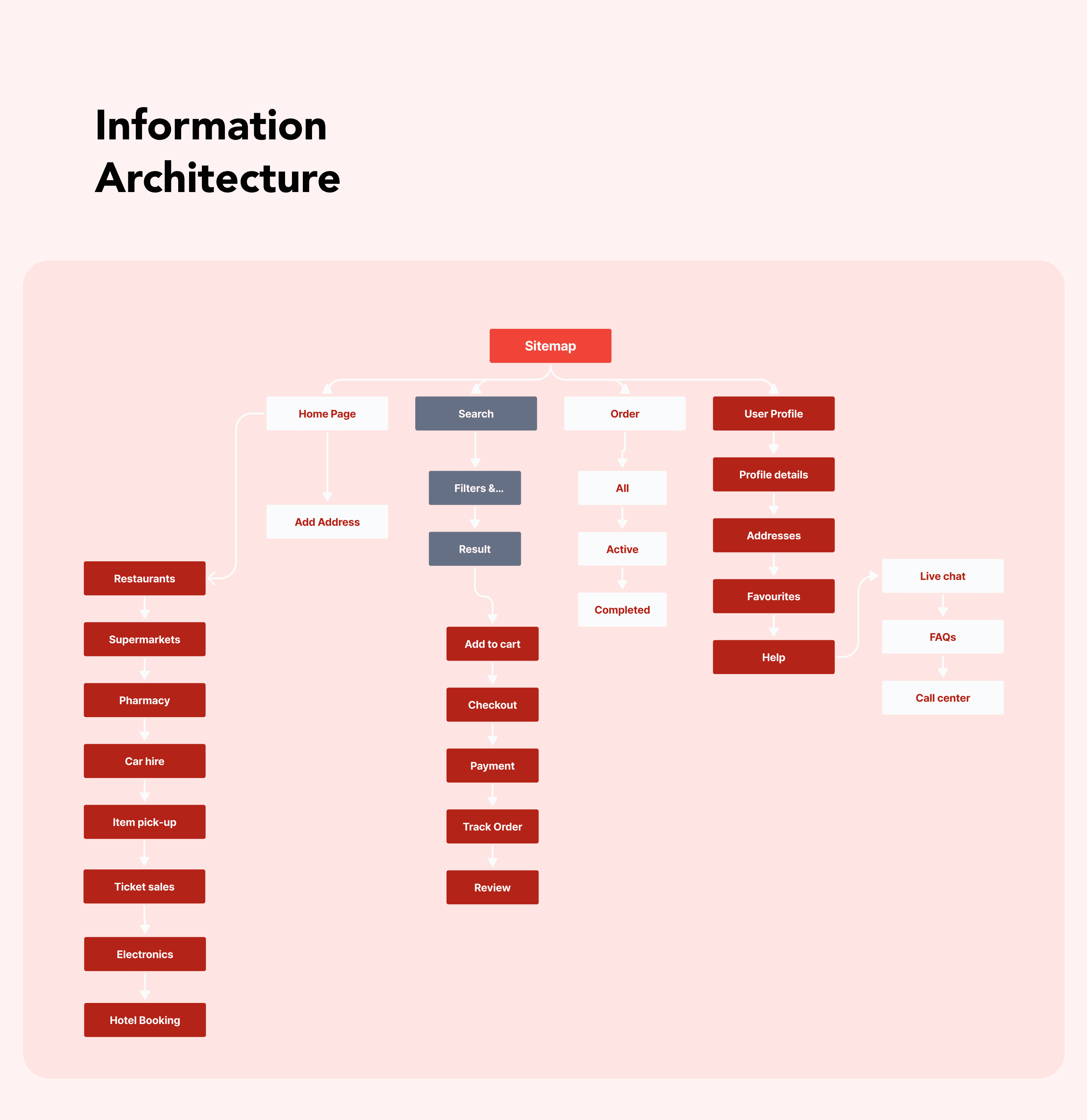
To address this, I focused heavily on simplifying navigation and reducing cognitive load across the platform. This started with defining the product structure through Information Architecture and mapping the primary journeys users would take across each service category.
Discovery
Before moving into visual design, I mapped out the different services and analyzed how users would likely approach them.
One key insight quickly emerged:
Instead of organizing the app around technical functionality, I organized it around user intent. I developed a simplified information architecture that grouped services into clear categories and ensured users could access core actions directly from the home screen.
I also created detailed user flows for each service from restaurant ordering and supermarket shopping to car hire and hotel booking to identify potential friction points before moving into interface design.
These exercises helped establish a consistent interaction pattern across all services, reducing the learning curve despite the platform's complexity.
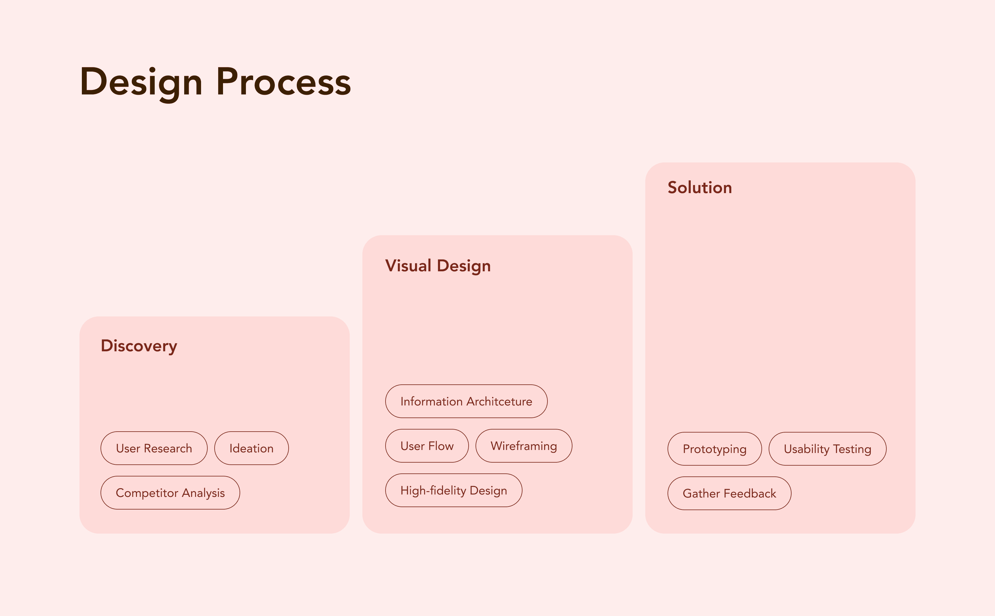
The Solution
The final solution centered around a single principle;Make complex services feel familiar.
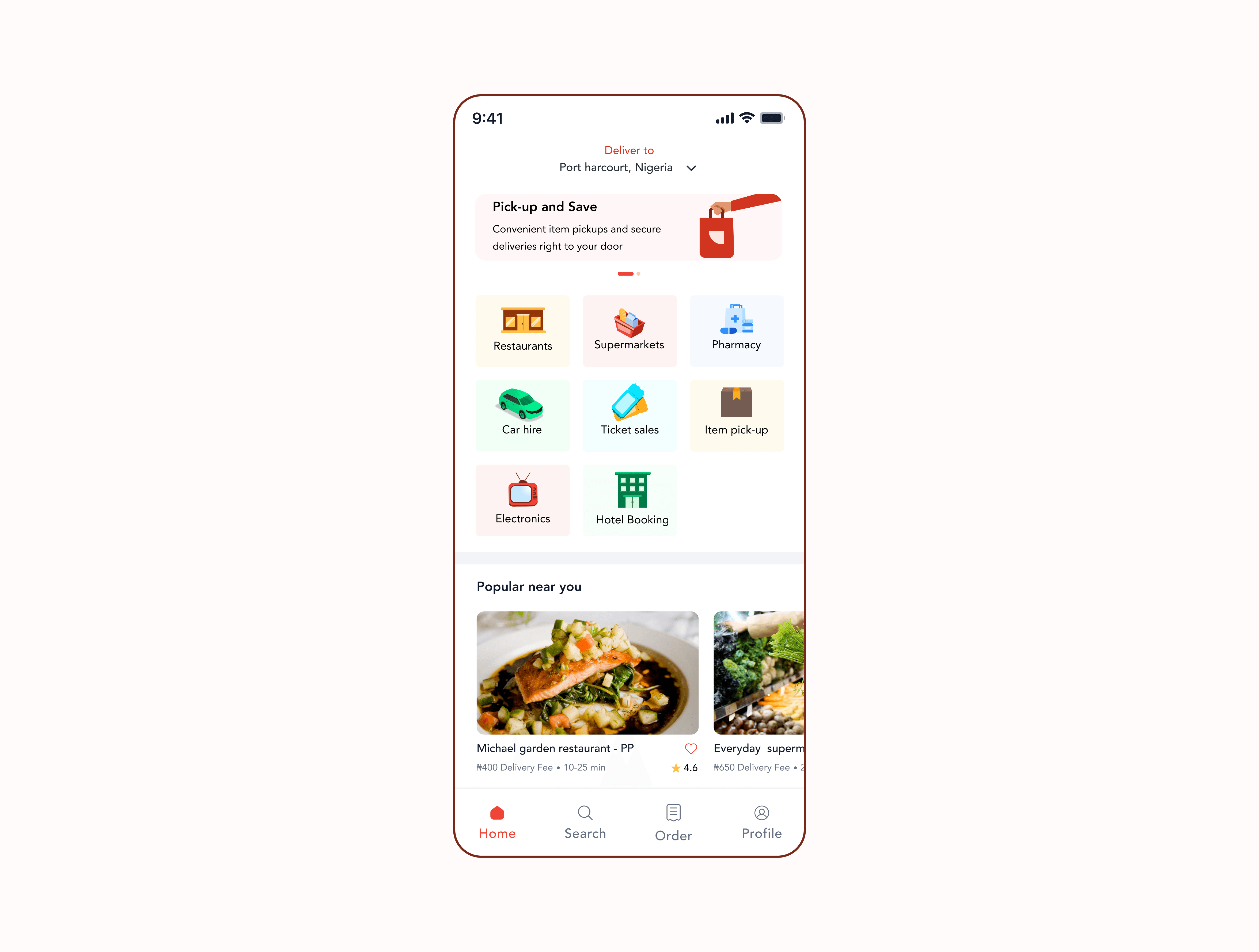
The home screen became the central command center of the platform, providing immediate access to all major services while surfacing personalized recommendations through the "Popular Near You" section.
To improve discoverability, I introduced illustrated category cards that gave each service a distinct visual identity.During testing, users repeatedly mentioned that the illustrations helped them recognize services faster and made navigation feel more intuitive.
Once inside a service, the experience followed a familiar structure regardless of the task:
Browse → Select → Confirm → Track
Whether users were ordering food, booking a hotel, hiring a car, or scheduling an item pickup, the interaction patterns remained consistent.
This consistency reduced friction and allowed users to move confidently through different parts of the platform without needing to relearn the interface.
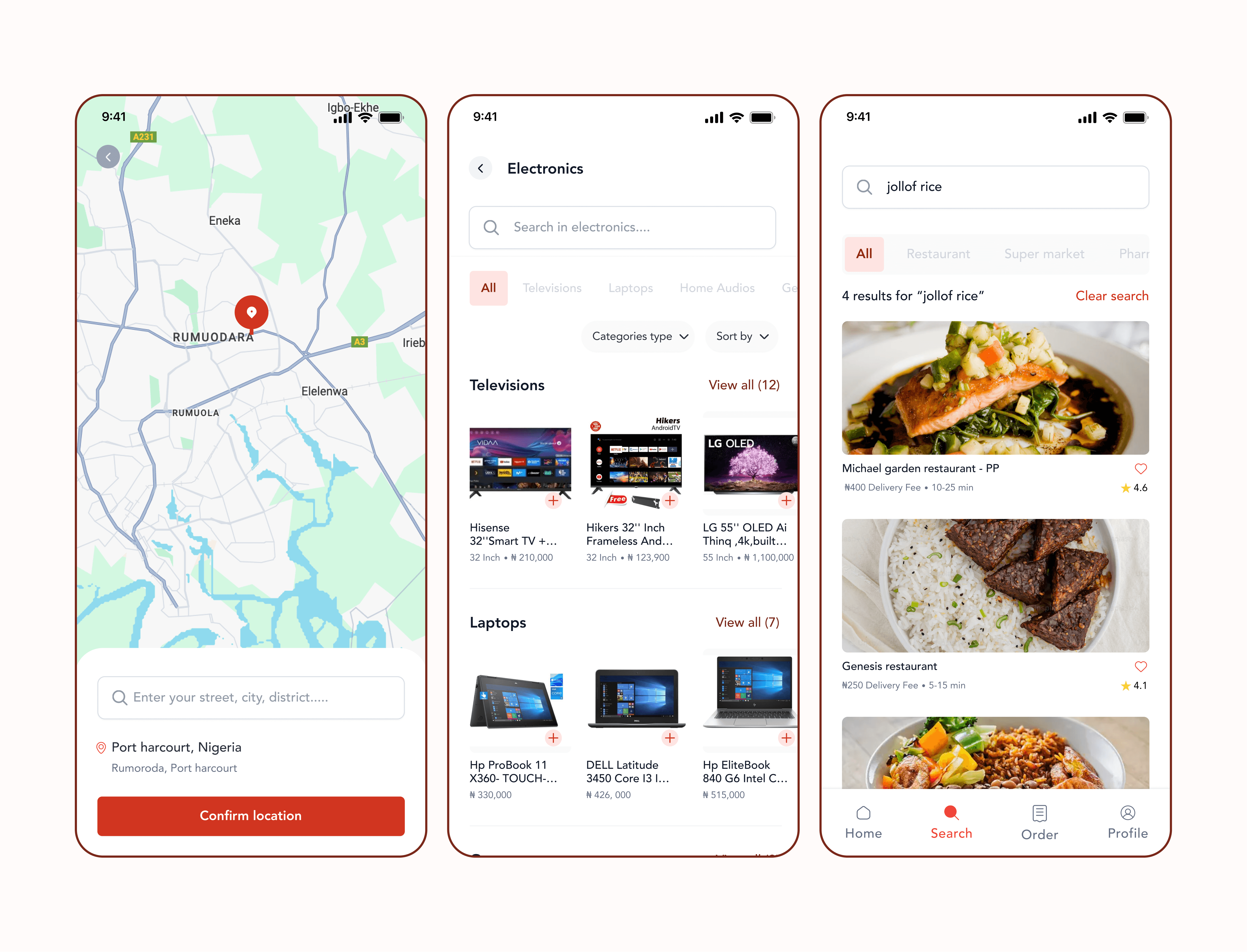
1. Home screen:
Presenting quick access to all service categories (restaurants, supermarkets, pharmacy, etc.) and personalized recommendations.
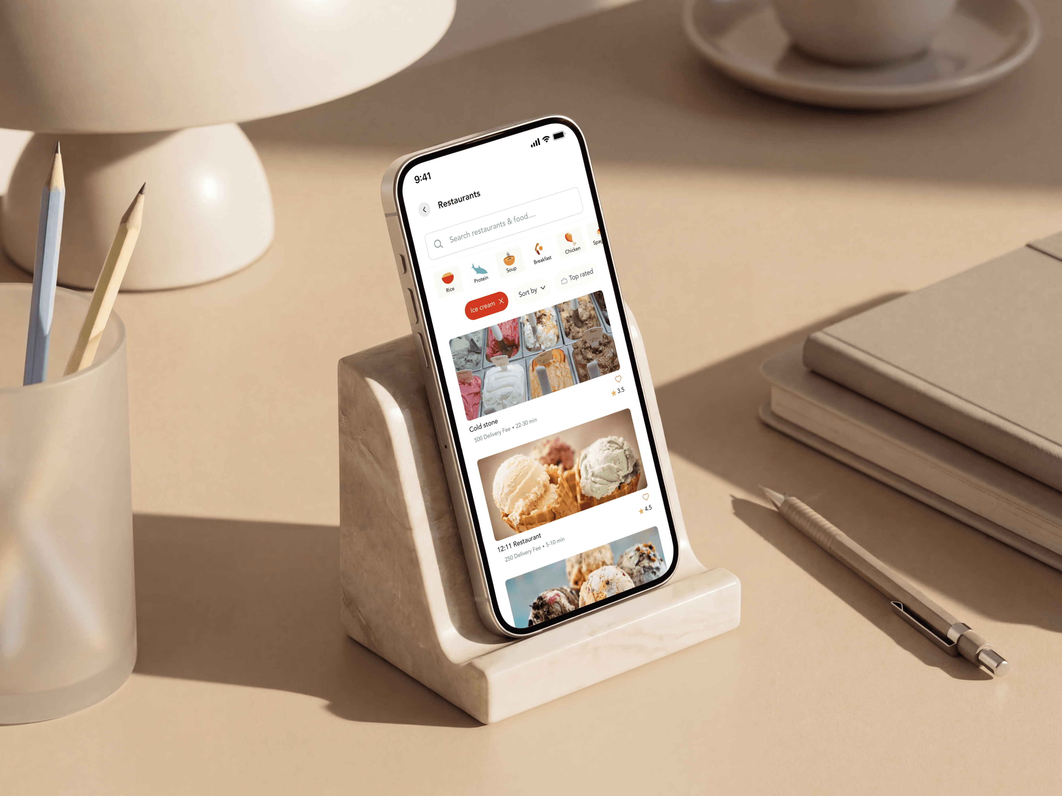
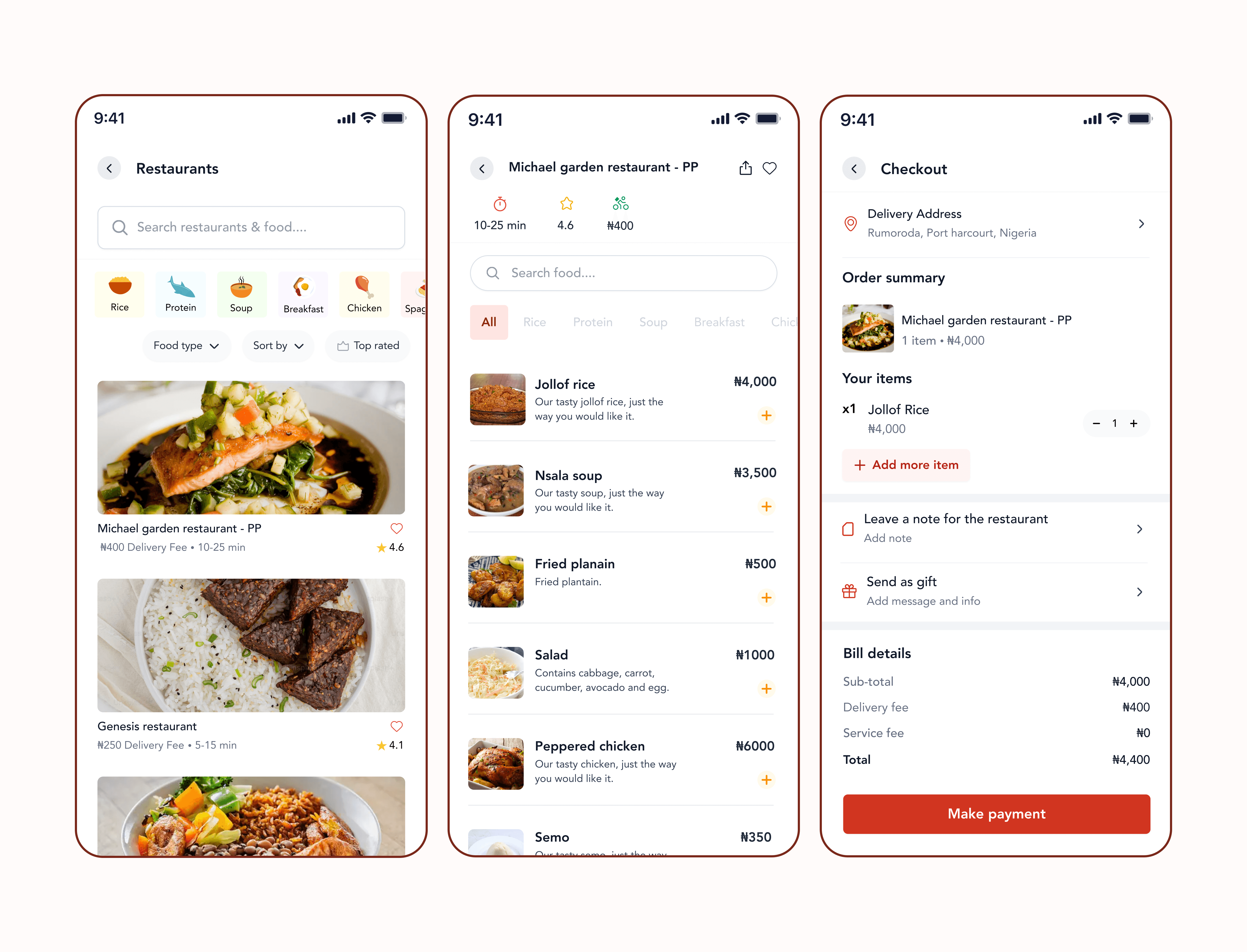
2. Restaurant:
Users can filter, sort, or search for their preferred restaurant or food before exploring details. Restaurant Details displays detailed information menu items, prices, images, ratings and an add to cart option, making selection and ordering seamless. Checkout shows selected items or bookings, delivery details, and payment methods. Users can confirm addresses, leave note, send as gift, and proceed to secure payment.
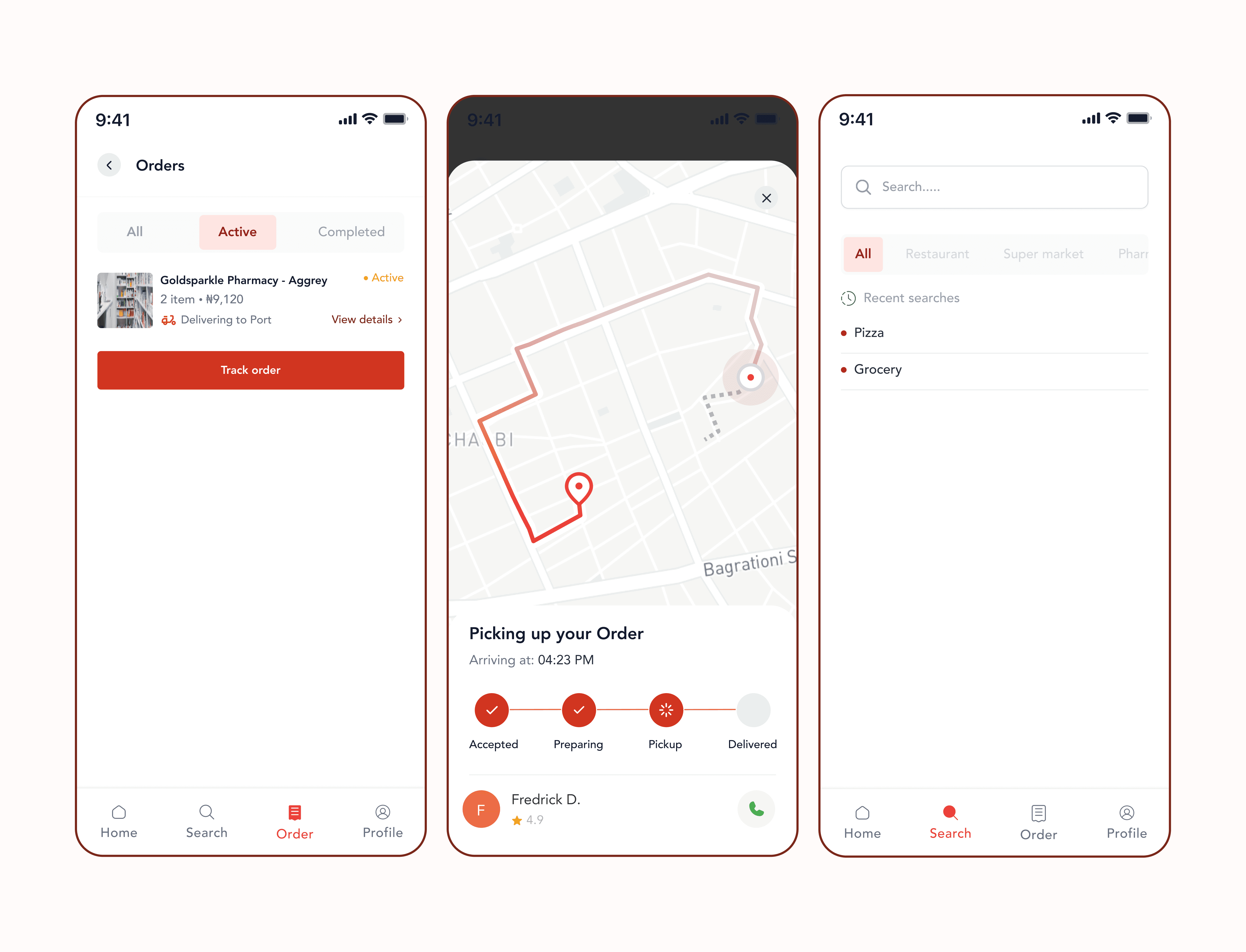
3. Orders:
Organizes all, active, and completed orders. Each entry gives a summary and an option to view full order details or track order. Order tracking provides real-time status updates after checkout. Includes a live map for deliveries or ride tracking, with estimated time of arrival and driver/rider contact options.
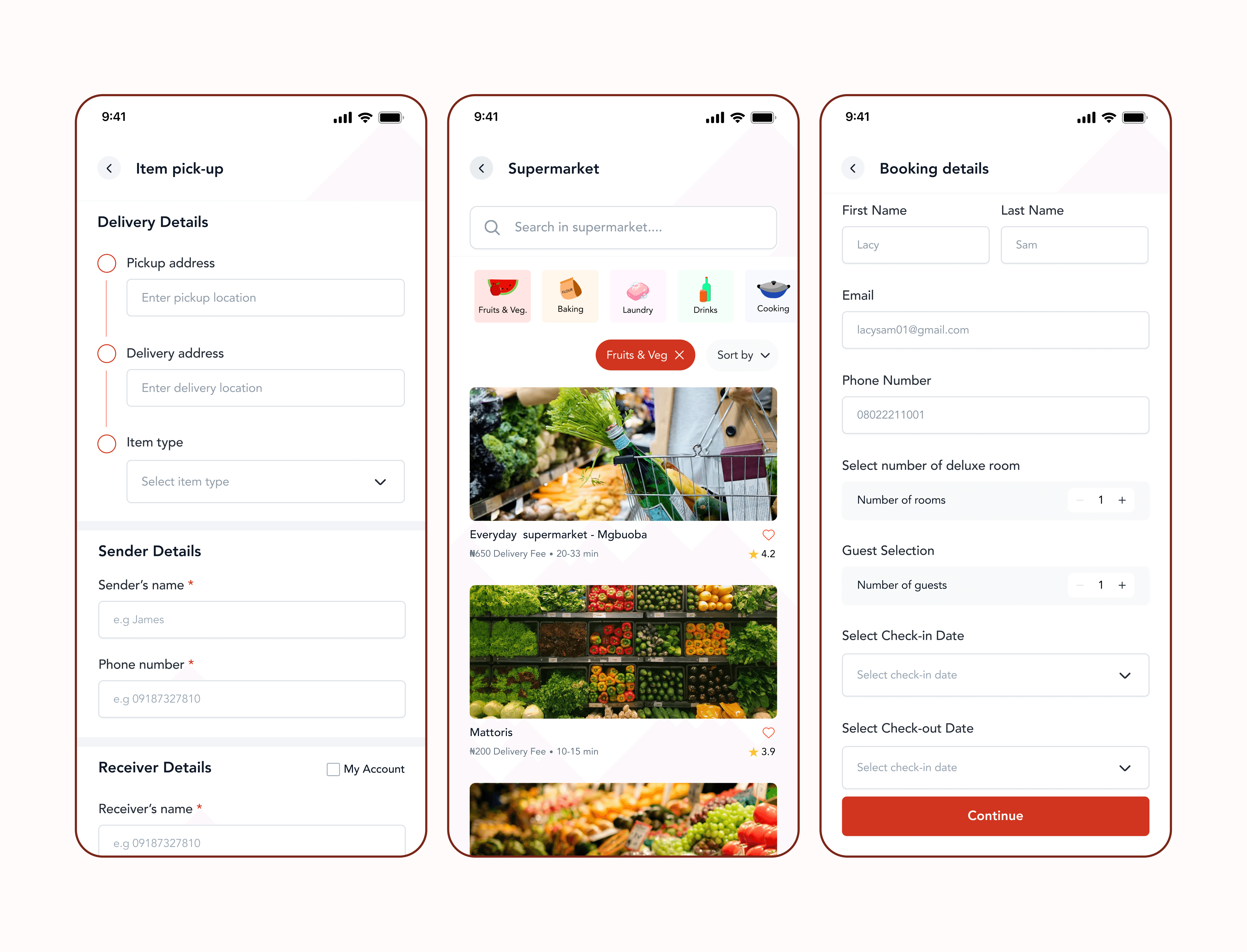
4. More screens
Learnings
Speedy taught me that designing a multi-service product is less about adding functionality and more about creating clarity.
As the number of services grows, information architecture becomes increasingly important. A well-structured product helps users focus on their goals rather than figuring out how the platform works.
The project reinforced the value of user flows, early structural thinking, and usability testing in shaping complex experiences. Most importantly, it demonstrated how consistency can transform a collection of separate services into a single cohesive product experience.